Monday, 1 October 2012

Newspaper Logos


In the planning and research for my own newspaper publication, I realised I have not yet made very much focus on newspaper logos and whether one will be included in my own work.


After doing some more of my own research, I have found that many current newspapers include their own logos and this allows these papers to be easily recognised and stand out amongst other leading publications. 

On my own newspaper, I plan on including a small logo of a seagull as my logo. I have decided this is appropriate for my paper as the area it is aimed at has it's own marina, (Portishead Marina) and Portishead is situated near the sea. 


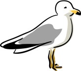
Here are some examples of pictures I found online of animations of seagulls in order to give me some inspiration:


Here is one example of an animation of a seagull, but this one features some colour which is most likely not an element I want my own newspaper logo to have. If this image had the colour retracted including the grey area then it would be a much more plan outline and because it's merely a seagull in a standing position, I do not think this is an effective enough newspaper logo. I prefer the idea of using a seagull flying for my logo, rather than just standing still as it's too plain and I want my newspaper logo to suggest freedom of speech and encourage people to read it. 


This is another example of an animation of a seagull, which in a more simplified version could be perhaps more suited and appropriate to be used as a newspaper logo, however I don't think this image would be as effective in a simpler form. For my own logo that I will create, I plan on having my logo all in one colour, instead of like in this example where the legs and beak of the seagull are featured orange. Another issue with designing a newspaper logo in a similar style to this one would be that this image is wider than the other ones I have looked at. This large width used mainly for the wings of the birds could be seen as wasting space and I'd rather feature a more compact design for my logo, that can fit easily around/near my masthead.


Pictured above is another flying animation of a seagull, however I found this image more interesting as is includes a background of the sea and sky. However I think this kind of design is too detailed for the simple kind of logo I am aiming to design and create on my own newspaper. However in my own logo design I may take elements of this without the sea and sky background.


Monday, 17 September 2012

Newspaper Content - Articles

Main Front Page Article -

"Fury at Local Burglary"

Many local residents have been left feeling panicked and distraught after the Portishead Mirage building was broken into last weekend. Three different appartments had their doors badly damaged and locks broken off as the culprit made their way into the homes. So far the items recorded to have been stolen are some very valuable belongings including one iPad, two laptops, and several other expensive appliances. One of the residents from these appartments came to us to explain her distress, "I have always felt so safe living where I live and this incident has made me doubt even my closest neighbours. The sooner this criminal is put behind bars, the better for everyone in our community.".
Improved security is said to be being placed at the entrances to the building but one man claims the damage has already been done. Most of the items that were stolen are said to have been insured, but it's the uncertainty of knowing the criminal is still out there that will haunt these residents insists one local resident. "I cannot put into words how devestating it is, knowing you cannot feel safe in your own home. I have lived here with my young daughter for five years now and never have I felt so worried for her or myself." 


Second Page Articles - 

"See No Evil, See Stunning Art!"

Artists from all over the world came together recently to form a truly magical display of art on Nelson Street in Bristol. One local young man Daniel Gordon was lucky enough to be able to take part in this memorable event by painting his artwork on one of the grand scale buildings involved in the project! He and the other artists aimed to create an outdoor gallery of world standard pieces of art, put forward to inspire and excite the community of Bristol. It represents hundreds of elements of the designs and styles in the street art world and thousands of people came together to celebrate this phenomenon. We asked Daniel how it felt to take part, "I've never felt so proud and honoured to express myself through my street art as I did taking part in this project."

"Turnaround Triumph! Local Hockey Team Goes for Gold!"

After training for many months, the Local Hockey Team have been thrilled to announce that they have qualified for the National Hockey Championships! The 18-25s gathered together recently to celebrate their achievements so far! The team captain Marsha Byrne explains, "We have worked so extremely hard for this, and I am so proud to hopefully strive to lead our team to victory! The girls and I have formed such strong friendships through our training together and now is the time to push harder than ever before."

"Olympic Pride Spreads Through the Nation!"

A true sense of unity has been spread through the community recently as people have come together to celebrate the outcome of The Olympics! There have been barbecues, fun runs, street parties and more all over Portishead to show our support for the athletes of Britain! We spoke to one local Pub Owner who claims "These last few weeks have been wonderful. It was just what we needed as a community; something to bring us all together in fun!" There have been reports of some local sports days and events being hosted in further celebration of the Olympics, and news will be released at a later date.

"Facebook Friends? Facebook Foes for One Local Girl"

Almost all young people these days will be proud owners of their own Facebook accounts, and most of the time we can recognise this as good, modern online friendship profiles. However this was not the case for one local girl, Jennifer Phillips. Bullies have targeted her for a number of months and have been making her life hell, writing explicit, hurtful comments on Jennifer's photos, status updates and much more. Jennifer's form tutor came forward and reported, "Jen hasn't appeared in school for weeks. The teachers and her friends have been getting extremely worried about her, this needs to stop before it's a comment too far." The bullies have been suspended from school and meetings with their parents have been arranged. Hopefully this will be the end of the misery this local girl has had to face. 
Thursday, 13 September 2012

Newspaper Photographs

Here I have chosen to blog some of the photographs that I will be using for my main front page image, my advert images, and some article stories too. 

Advertisement Photographs -


Here is the photo I plan on using for one of my front page adverts, "Marina Boat Trips". I have chosen to include the marina obviously, and have tried to include enough white/light space in the photograph so that layering dark coloured text over the picture won't be an issue. Still allowing people to read it easily. 


This is the photograph I am planning on using for my advertisement for a local photographer. I plan on having white text layered over this image, with details of the photographer including email address and phone number. I have based the inspiration for this advert on an existing photography company named "Planet Photon". Here is the image used for their advert, and where my inspiration for my own image came from:


Tuesday, 11 September 2012

Mock up of second page layout - Made on Powerpoint

Here is a mock up I created of the second page of my newspaper to give me a basis for when I start creating my final product. 
There will be two adverts on this page, the larger of the two being for a local photographer. For this advert I plan on having a high quality photograph supposedly taken by this photographer with their information layered over this picture. My other advertisement will be for a local PR company, based on an advert along the lines of this one:

The main article lines on this page will read "See No Evil, See Stunning Art!", and my article will be positioned in the section below my main image. This article will be aiming to persuade people to go and witness the amazing graffiti exhibition for themselves!
At the bottom of my page will be another article, this time about a local girl being bullied over Facebook. The headlines for this article being "Facebook Friends? Facebook Foes for One Local Girl". My image positioned next to this article will be an over the shoulder shot of someone sitting on a computer/laptop with the Facebook homepage up. I thought this would be a more sufficient choice of photograph in comparison to an image of the local girl in question, as the article covers a sensitive topic and a real local newspaper would not want to single out this girl in her time of distress. 
Either side of my main image of the See No Evil artwork will be my other two articles, "Turnaround Triumph! Local Hockey Team Goes for Gold" and "Olympic Pride Spreads Through the Nation". Both of these articles won't have images.

Mock up of front page layout - Made on Powerpoint


This is a mock up I created on powerpoint of my newspaper front page, with very basic labels to explain my thought process and where I plan on locating the different features that make up a generic local newspaper front page. 
I will have three columns for my main article surrounding my main cover image of The Mirage building in Portishead. These columns will include a brief introduction to my main article and will give my target audience something to entice them into buying my newspaper. I will later take some more photographs of this building and blog which one I will be using and why, based on lighting, angle and and shot type. Layered over this photograph of the building, will read my main cover lines "FURY AT LOCAL BURGLARY!". I plan to make it so these words are layered to fit in line with the different tiered levels of the building, giving my front page an advanced design layout. 
On my final product, I may decide to make my main cover image larger, as this would abide more closely to the expected conventions of a local newspaper. This would also result in less of my main article being written on the front page, which I think is an effective way to make people want to purchase my product by wanting to read on after only previewing a small section of the whole article. 
I will have three adverts at the bottom of my front page, two of similar size and one roughly double the size of these two. I have aimed to appeal to both genders with my adverts, having one aimed at women, one aimed at men, and one potentially appealing to both genders. For the marina boat trip advert I may experiment with different photographs of the marina and different boats docked here in order to capture a quality photograph to attract my audience to this offer. For my advert on local car specialists, I will have a picture of a nice parked car I expect, or possibly a garage connoting ideas of cars being fixed and repaired. Finally, for my local hair and beauty salon I will take a photograph of one of the existing salons and layer my information on top. 
For my masthead, the words "GORDANO EXPRESS" will be written in thick black lettering across the top of my page. I plan on using a font similar to this in a serif type font. Below my masthead is my tagline "AT THE HEAD AND HEART OF THE LOCAL COMMUNITY" however I may change it to "our community" rather than "the community", as this would make my newspaper seem more representative of the views and opinions of the local community and allows people to interpret the newspaper as 'one of them'. 

Mock up of second page layout - Sketch


Here is my sketched mock up of my newspaper second page. I am going to have my main image on this page to be placed in the centre, surrounded by separate articles and placed just above the story it will accompany. This article will be about the See No Evil graffiti art exhibition in Bristol, and this is what my main image will be of, and I will state that a local teen has been lucky enough to take part in the exhibition, and explain that the piece of graffiti pictured is their work. The headlines for this main article will be placed where it reads "MAIN HEADLINES HERE" in large letters.
On the bottom right of my newspaper second page, I plan to place an advert I will later create advertising a local photographer, with a high quality photograph as the background of the advert. Along the bottom of my page, I will position another smaller article about a local girl being bullied over Facebook, with an over the shoulder shot of a computer screen and the Facebook logo popping up. Above this article on the left hand side of my page, I will put an even smaller article, this time without a picture. At the top left hand side of the second page of my newspaper, I will have a small article with no photograph of a local sports team "going for gold". The article in the top right corner will be about "Olympic Pride" spreading through the nation.

Thursday, 6 September 2012

Mock up of Front Page Layout - Sketch

Here is my quickly sketched mock up of my front page layout. 
(this isn't my decided font, just used this one for a template!)
The tagline on my newspaper will read; "AT THE HEAD AND THE HEART OF THE COMMUNITY" which I have positioned just beneath my masthead. The date will be just beside this. 
I have decided to have my main image positioned to the left, with my cover lines being layered over the top of this photograph. For my main image on the front page of my newspaper, I was considering using a photograph of The Mirage building in Portishead, which is designed in a tiered way, which I thought would work excellently on my front page as my headlines would be able to fit in the space around the building, being written over the sky/space behind the building in the photograph. This technique of text and picture layout will help give my front page the professional edge I want it to have, and will show I have thought through the best way to make everything layered effectively in order to attract my target demographic.
Surrounding this will be my main article, as shown in my sketch. (The long columns with horizontal lines on them)
Along the bottom of my front page I will have 3 adverts, two small ones to the left side and a third larger one to the left. Starting from left to right, these adverts will be advertising Portishead Marina boat trips, Local car specialists, and a local hair and beauty salon. I think these are three useful adverts to include on my front page because there is one appropriate for each gender. Hair and beauty will help to attract my female audience to purchase my newspaper, cars could attract both genders but perhaps more men than women, and Marina boat trips could attract both. By targeting my audience when considering my chosen advertisements, I can maximise the newspaper's potential readership.