In the planning and research for my own newspaper publication, I realised I have not yet made very much focus on newspaper logos and whether one will be included in my own work.
After doing some more of my own research, I have found that many current newspapers include their own logos and this allows these papers to be easily recognised and stand out amongst other leading publications.
On my own newspaper, I plan on including a small logo of a seagull as my logo. I have decided this is appropriate for my paper as the area it is aimed at has it's own marina, (Portishead Marina) and Portishead is situated near the sea.
Here are some examples of pictures I found online of animations of seagulls in order to give me some inspiration:
Here is one example of an animation of a seagull, but this one features some colour which is most likely not an element I want my own newspaper logo to have. If this image had the colour retracted including the grey area then it would be a much more plan outline and because it's merely a seagull in a standing position, I do not think this is an effective enough newspaper logo. I prefer the idea of using a seagull flying for my logo, rather than just standing still as it's too plain and I want my newspaper logo to suggest freedom of speech and encourage people to read it.

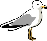
This is another example of an animation of a seagull, which in a more simplified version could be perhaps more suited and appropriate to be used as a newspaper logo, however I don't think this image would be as effective in a simpler form. For my own logo that I will create, I plan on having my logo all in one colour, instead of like in this example where the legs and beak of the seagull are featured orange. Another issue with designing a newspaper logo in a similar style to this one would be that this image is wider than the other ones I have looked at. This large width used mainly for the wings of the birds could be seen as wasting space and I'd rather feature a more compact design for my logo, that can fit easily around/near my masthead.

No comments:
Post a Comment